
Friday, December 23, 2011

Thursday, November 17, 2011


Wednesday, November 16, 2011


Monday, November 7, 2011


Sunday, November 6, 2011


Friday, October 28, 2011
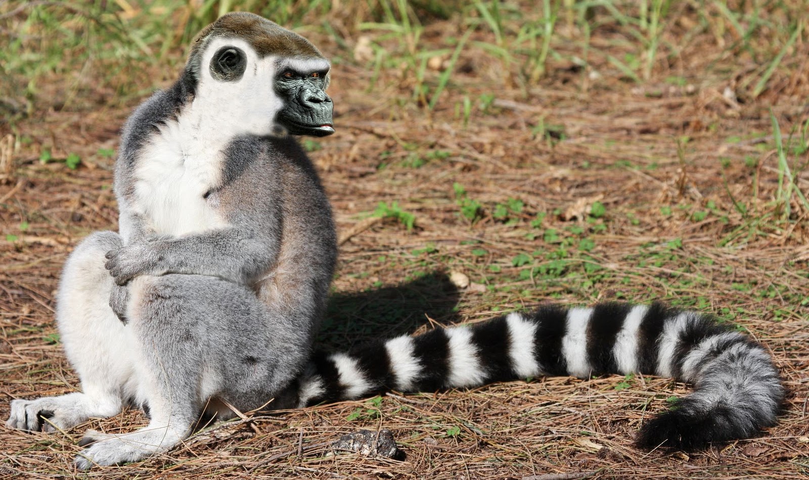
My Career Dreams competition/project

My entry for the NCDA Poster Competition. The theme was "My Career Dreams" and I will update on how I did in the competition once I know

Thursday, October 13, 2011
Monster Poster

This is a poster I had to make for Computer Design Basics. The main project was making an animate object out of inanimate objects.
Wednesday, October 12, 2011
Lithos Pro Poster

Friday, September 2, 2011

Saturday, May 28, 2011

Monday, May 16, 2011

Tuesday, May 10, 2011

Wednesday, May 4, 2011

Tuesday, May 3, 2011


Sunday, April 17, 2011

Saturday, April 16, 2011

Tuesday, April 12, 2011
Fantasy Tutorial

I'm currently working on a picture that is somewhat like this, yet a billion new ideas keep popping into my head. Maybe I'll do all of the ideas one day... maybe.
Thursday, April 7, 2011

Tuesday, April 5, 2011

Thursday, March 31, 2011

Tuesday, March 29, 2011
Unbelieveable School Ideas
1. Floating trailers, next to C building.
2. Buses stacked on top of each other for parking.
3. Teacher yelling, fist hitting student
4. Snail with jet engine on back. feet around it.
5. Eye on the clock. Picture of an eye with a clock as the iris/pupil
6. Words just jump off the page. enjoy reading
7. Boring school wall with a picture of what a kids would rather be doing out the window..
8. Get into the art. upper body drawing the rest of the body.
9. Opening a door to a new career.
10. School looking like a war zone.
Planets/Theme Project


Thursday, March 24, 2011


Monday, March 21, 2011
Brush Compositions


Friday, March 18, 2011

Thursday, March 17, 2011

Tuesday, March 15, 2011

Monday, March 14, 2011

Sunday, March 13, 2011
Needs a name. Suggestions?

Thursday, March 10, 2011


Subscribe to:
Posts (Atom)